Teachers
GCSE map skills · 15 minutes · no login
Map projections
All teacher notes · Open the lab · 2178 words · ·
Why this lesson, and why the 3D
Map projections is a fifteen-minute projector lesson, not a homework packet and not a film with a quiz bolted on. Put this hook on the board before you dim the lights: Peel an orange and the skin tears. Every world map is a compromise. Greenland is the giveaway. By the end of the slot a pupil should be able to morph a globe to Mercator, equal-area, and a compromise, and say what each distorts. Curriculum tags in the header (GCSE map skills; NGSS MS-ESS2-2) are filters, not a flag. The room is worldwide; SI first; International English. Ages on the card (KS3, GCSE, NGSS MS) are a suggested band, not a gate.
A classroom wall map is a projection, not the true size of countries. News maps that grow Russia and shrink Africa are a choice about area, not a verdict on people. Start with area. Greenland is the giveaway: on Mercator it looks about the size of Africa; on the globe it is far smaller. Iceland sits at high latitude, so it balloons on the same family of maps. Greenwich is a meridian, not a map — the plaque does not flatten the Earth. An OS sheet of Snowdonia and a USGS quad of Yosemite are local projections with different jobs; they are not a moral statement about the world. Atlas versus this site’s tools/map: both flatten; this lab says how, and what you lose when you peel the orange.
The 3D is a named, inspectable object. Click the part, not a caption. If the model will not spin, the Why panel still carries the mechanism, the two photographs, and the film. Do not apologise for the model. Drive it. A silent spin teaches a screensaver. A named mesh that changes under a slider teaches the process.
Fifteen minutes on the projector
Start on the globe. Ask Greenland versus Africa. Greenland is smaller than Africa. Do not start a culture war. Start with area. Scrub Flatten toward the gores. The orange peel tears at the cuts. Then Mercator. High latitudes balloon. Rhumb lines go straight. Sizes on the wall map are not true sizes. It is a projection. That is the misconception. Compare Greenland and Africa on the globe first. Equal-area keeps relative size; shapes then take the hit. There is no honest single map of the whole Earth. Choose the lie you can live with. Do not teach one projection as morally pure. Local OS maps are a different problem. News maps that grow Russia and shrink Africa are a projection choice. Finish in Check.
Open the lab full screen (F). Labels on (L). Speak the first step before you touch a slider: Start on the globe. Greenland is smaller than Africa. Then the second: Mercator: rhumb lines straight, high latitudes balloon. Equal-area: sizes fair, shapes suffer. Compromise: neither perfect. Then the third: There is no honest single map of the whole Earth. Choose the lie you can live with.
The sliders that earn their keep are Flatten. Space plays; arrows nudge time; R resets. Parameters the URL can remember: morph. If you only have eight minutes, skip the last step and finish in Check. Projector layout (P) is for the back row: one idea, large type, the model still live.
Start on the globe. Ask Greenland versus Africa. Greenland is smaller than Africa. Scrub Flatten toward the orange-peel gores: the skin tears at the cuts. Then Mercator: high latitudes balloon. Ask what happened to Greenland’s area before you name the projection. Leave labels off until the class can say which view is the globe. Do not start a culture war at the slider. Start with area, then rhumb lines as the navigation reason Mercator survived. Keyboard: L labels, R reset. Flatten slider lives in the control bar. The readout names globe, gores, then Mercator-like flatten. Compare sizes before names.
The in-site film is “What is a Map? Crash Course Geography #2” (Crash Course Geography, about 11 min, Crash Course / Complexly on YouTube. Standard YouTube licence. Educational embed, autoplay off.). Autoplay is off. Play one minute if you need a second voice; do not let the film eat the slot. The 3D still has to move under your hand.
What the third row will get wrong
You will hear the misconception before you have finished the first sentence. Write the false claim on the board and leave it there until the model has contradicted it. Do not skip this. A fluent pupil can recite the hook and still believe the false sentence.
“The classroom wall map is the true size of countries.” — no. It is a projection. Compare Greenland and Africa on the globe first.
“Mercator is a political lie designed to make the north look powerful.” — no. Mercator was built for rhumb-line navigation. High latitudes balloon as a geometric cost. Start with area, not with a culture war.
“There is one honest map of the whole Earth.” — no. Every world map is a compromise. Equal-area keeps size and spends shape. The globe is the reference; local OS maps are a different problem.
Pitfalls to keep in your pocket: Teaching one projection as morally pure. Starting a culture war instead of starting with area. Forgetting that local OS maps and USGS quads are a different problem. Treating Greenland’s Mercator size as a fact about ice, not a fact about the map. Do not let a pupil leave thinking the 3D is a photograph. It is a teaching model. Where vertical exaggeration exists, T collapses it and the caption says so. A labelled lie of scale is honest. An unlabelled one is a cartoon.
Two places, not a slogan
Do not start a culture war. Start with area. A sphere does not flatten without tears. Peel an orange: the skin rips. Every world map chooses what to keep and what to distort. Mercator keeps local shape — it is conformal — and makes rhumb lines, paths of constant bearing, straight, which is why it was used at sea. High latitudes balloon, so Greenland and Iceland swell while Africa looks small. Africa is about fourteen times the area of Greenland. Mercator hides that. An equal-area projection keeps relative sizes of regions; shapes then take the hit. A compromise is neither perfect. The globe in this lab is the reference: a sphere almost does not need a projection. Projections start when you flatten. Orange-peel gores show the tears at the cuts. Local OS maps and USGS quads are a different problem — a projected grid on a small patch, not a world poster. There is no honest single map of the whole Earth. Choose the lie you can live with. Do not teach one projection as morally pure. Area first, then shape, then the navigation story.
The first place to land is Greenwich as a meridian, not a map. The second is High-latitude size trap. Same process, different rock or climate. If a pupil can only name one place, they have a postcard, not a mechanism. Atlas entries for those names are a click from the case list; send them back to the lab with one sentence they can say in Check.
Do not flatten the comparison into “this country versus that country.” Name the landform. Holderness is till, not chalk. Hawaii is a hotspot, not an island arc. Yosemite is a glacial trough, not a river canyon. The 3D is allowed to be schematic; the place names are not allowed to be sloppy.
Figures and the film
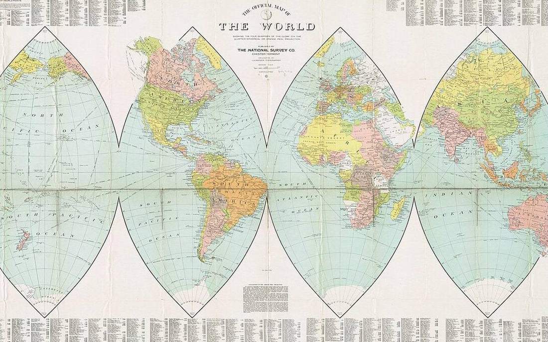
Field photograph: A projection as a peeled sphere. A projection as a peeled sphere. This is the classroom sense of map-projections: a named landform, process, or object. Source: Wikimedia Commons / NASA / USGS / NOAA, public domain or CC. Credit: Wikimedia Commons / NASA / USGS / NOAA, public domain or CC.
Mechanism photograph: Field photograph or official scientific figure for teaching map projections. Field photograph or official scientific figure for teaching map projections. A second photograph for the projector script — not the lab cover. Source: Wikimedia Commons / NASA / USGS / NOAA, public domain or CC. Credit: Wikimedia Commons / NASA / USGS / NOAA, public domain or CC.
Two photographs, two jobs. The field picture is the place. The mechanism picture is the process. Do not run the lesson on a single Apollo Earth disc. A carbon-cycle class is a forest and a seam, not a blue marble. An ENSO class is a Pacific temperature map, not Africa from Apollo 17.
Words they must be able to say
Say these out loud once while you click the matching mesh. If a word has no mesh, it still has a photograph in Terms.
Projection: A rule for flattening the globe onto a plane. Every rule distorts something. Mercator: Conformal cylindrical. Rhumb lines straight. Distorts area toward the poles. Equal-area: Preserves relative area of regions. Distorts shape. Exam language also accepts “Equivalent projection”. Conformal: Preserves local shape and angles. Area then takes the hit. Exam language also accepts “Orthomorphic”. Rhumb line: A path of constant bearing. Straight on Mercator; not the shortest route. Exam language also accepts “Loxodrome”. Gores: Orange-peel strips of the globe. The tears at the cuts are the cost of flattening. Compromise projection: A map that splits the distortion so nothing is perfect and nothing is ruinous. Distortion: What a projection spends: area, shape, distance, or direction. You cannot keep all four on a world map.
Exam-language toggle (the Teacher tab) swaps UK/US pairs where they exist — levée/levee, arête/arete — so a mixed room is not punished for spelling.
Close the slot
The land outlines are teaching silhouettes, not a traced census of coastlines. Greenland and Africa are sized so the area lie reads from the back row. Gores are schematic strips, not a printer’s template. Mercator here is Mercator-like: enough stretch to see the balloon, not a navigation chart. Local OS and USGS sheets are off-stage; they flatten a county, not a planet. Without the 3D view: a globe needs no projection; flattening tears; Mercator inflates high latitudes; equal-area keeps size and spends shape; there is no honest single world map. Start with area, not with a quarrel.
Finish in Check — ten questions, not a mood. The bank mixes definition, process, the misconception you just killed, a named place, and a read-the-model item (click the part; T). If a pupil can only recite the hook, they have not used the geometry. Wrong answers still show the one-line explain. Do not skip the explain.
Sources on the Teacher tab are the trail, not a bibliography to copy. USGS map projections; Natural Earth.
Link back to the live lab and keep the same slug. Do not invent a parallel worksheet that contradicts T, SI, or the named parts.
This note is worldwide. Curriculum tags (GCSE map skills; NGSS MS-ESS2-2) are filters, not a flag. A class in Nairobi, London, or Shanghai can use the same 3D. Ages (KS3, GCSE, NGSS MS) are a suggested band. If a sentence only works in one exam board, rewrite it before you project it.
Write these three lines on the board before you dim the lights. One: Peel an orange and the skin tears. Every world map is a compromise. Greenland is the giveaway. Two: the misconception “The classroom wall map is the true size of countries.”. Three: the named parts they must click. Then drive the model. Check is ten questions covering definition, process, the misconception, a place, and a read-the-model item. Do not skip the explain on a wrong answer.
Board, units, and what not to say
SI first. Metres, kilometres, degrees Celsius, metres per second. A conversion in brackets is courtesy, not a second system. Do not let a pupil leave thinking the 3D is a photograph. It is a teaching model. Where vertical exaggeration exists, T collapses it and the caption says so.
Do not say “teaching mesh”, “sprinkle”, or “thin free surface not a fat pipe” out loud. Say the landform. Seasons are ~23.44° of axial tilt, not Earth–Sun distance. The outer core is liquid; S-waves do not pass. Yosemite is a glacial U-trough. San Andreas is a transform. Hawaiʻi and Yellowstone are hotspots. Florida is not a glacial trough.
If the room is noisy, projector layout (P) is the back-row setting: one idea, large type, the model still live. Full screen (F). Labels (L). Space plays. Arrows nudge time. R resets. The URL can remember morph. Send them home with the same link; there is no login.
A classroom wall map is a projection, not the true size of countries. News maps that grow Russia and shrink Africa are a choice about area, not a verdict on people. Start with area. Greenland is the giveaway: on Mercator it looks about the size of Africa; on the globe it is far smaller. Iceland sits at high latitude, so it balloons on the same family of maps. Greenwich is a meridian, not a map — the plaque does not flatten the Earth. An OS sheet of Snowdonia and a USGS quad of Yosemite are local projections with different jobs; they are not a moral statement about the world. Atlas versus this site’s tools/map: both flatten; this lab says how, and what you lose when you peel the orange.
In-site film
What is a Map? Crash Course Geography #2. Crash Course Geography. Crash Course / Complexly on YouTube. Standard YouTube licence. Educational embed, autoplay off. Autoplay off.